
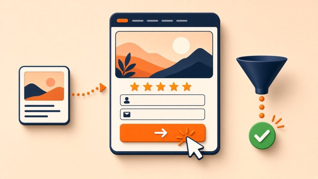
Landing page best practices come down to focus and trust. A good landing page has one goal, a headline that matches the ad or link that brought the visitor, a clear call to action visible without scrolling, proof such as reviews and client results, a short form or one-tap contact option, and fast loading on mobile. Removing distractions like full site menus and testing one change at a time are the most reliable ways to turn more clicks into enquiries.
What a landing page is, and why it differs from a homepage
A homepage introduces the whole business and serves many visitors with different needs. A landing page is built for one audience and one action: book a consultation, request a quote, download a guide or buy a product. Visitors usually arrive from an ad, email, social post or search result with a specific expectation.
Sending paid traffic to a homepage forces people to find their own way. A focused landing page answers the question that made them click and shows exactly what to do next.
Match the message to the source
Message match means the landing page repeats the promise the visitor clicked on. If an ad says “Teeth Whitening in Ranchi, Same-Day Appointments”, the headline should say the same, not “Welcome to Our Clinic”.
When the page matches, visitors immediately know they are in the right place. When it does not, many leave within seconds. For campaigns with several ad groups, create separate landing pages or dynamic headlines for each main offer or service.
Write a clear headline and opening
The headline should state the outcome or offer in plain words. A short subheadline can add who it is for, where, or the key differentiator. Below that, two or three lines or bullets should answer the questions a visitor has first:
- What exactly is offered?
- Who is it for?
- What does it cost, or what is the next step?
- Why choose this business over the alternatives?
Avoid clever wordplay and vague slogans. Clarity converts better than creativity on a landing page.
Make the call to action obvious
The primary call to action should be visible on the first screen on both mobile and desktop, and repeated further down the page for people who scroll.
- Use action-focused button text such as “Get my free quote” or “Book a free consultation” rather than “Submit”.
- Give the button a contrasting colour so it stands out.
- Offer the contact methods your audience prefers. In India, a click-to-call button and a WhatsApp button often convert better than forms alone.
- Keep one primary action; secondary links compete for attention.
Keep forms short
Every extra field adds effort. Ask only for what you need to follow up: often name, phone number and one qualifying question. You can collect more detail during the first conversation.
That said, a qualifying question can improve lead quality. A dropdown asking about budget range, service needed or timeline helps filter enquiries without adding much friction. Test both versions if lead quality is a concern.
After submission, send people to a thank-you page that confirms what happens next and when. This page is also the cleanest way to track conversions.
Add proof close to the decision
Visitors need reasons to trust a business they may never have heard of. Place proof near the headline and near the form, where doubts are strongest:
- Google review rating and short customer quotes with names.
- Logos of clients or media outlets that have covered the business, used with permission.
- Specific results or case examples you can verify.
- Certifications, years in business or professional registrations.
- Photos of the real team, premises or work.
Remove distractions
A full navigation menu, footer full of links and social icons all give visitors ways to leave. On dedicated campaign pages, simplify the header to the logo and a phone number, and keep links focused on the conversion. Answer common objections on the page itself, through a short FAQ section, rather than sending people elsewhere.
Design for mobile and speed
Most ad traffic, especially from social media, arrives on phones. Design for a small screen first:
- Large tap targets and readable font sizes.
- Short paragraphs and scannable sections.
- Compressed images and minimal scripts so the page loads quickly on mobile data.
- A sticky call or WhatsApp button that stays visible while scrolling.
A slow page wastes ad spend before visitors see anything, so check loading speed with PageSpeed Insights before launching.
Track and test
Without tracking you cannot tell which page, ad or audience produces enquiries. Track form submissions, calls and WhatsApp clicks as conversions in Google Analytics 4 and your ad platforms.
Then test one change at a time, such as a new headline, a shorter form or a different offer. Give each test enough traffic and time to produce a reliable result, and judge by qualified leads, not just form fills.
Common landing page mistakes
- Several offers on one page, leaving visitors unsure what to do.
- A headline that does not match the ad.
- Long forms asking for information you do not need yet.
- Generic stock photos instead of real proof.
- No thank-you page or conversion tracking.
- Changing several elements at once, so nobody knows what worked.
Frequently asked questions
How long should a landing page be?
Long enough to answer the visitor’s main questions. Simple, low-cost offers can convert with short pages; expensive or complex services usually need more explanation, proof and FAQs.
Should each ad campaign have its own landing page?
Ideally, each distinct offer or audience should. A page that speaks directly to one service and location usually outperforms a generic one.
Can landing pages rank in Google search?
Campaign pages are usually built for conversions, not search. If you want organic traffic as well, create a full service page with more depth and link to it from the site.
Build pages that convert
Our lead generation and web development teams design and test landing pages for paid and organic campaigns. Read our guide to tracking website leads, or book a free consultation.